Logo design

Don't mind me. I'm here just adding some space for our amazing cubic-bezier zoom effect to work. I get paid for this.


Pixel-perfect
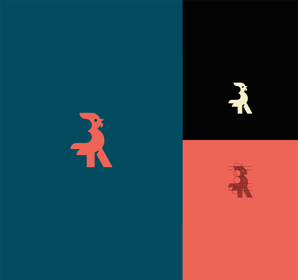
A logo doesn't just need to look good. Ideally, it should follow design principles, for example, of unity, weight, balance, symmetry, and more. On top of that, Gestalts principles, the golden ratio, and other art-oriented systems can be applied to most logos in order to create naturally beautiful identity.


Practical
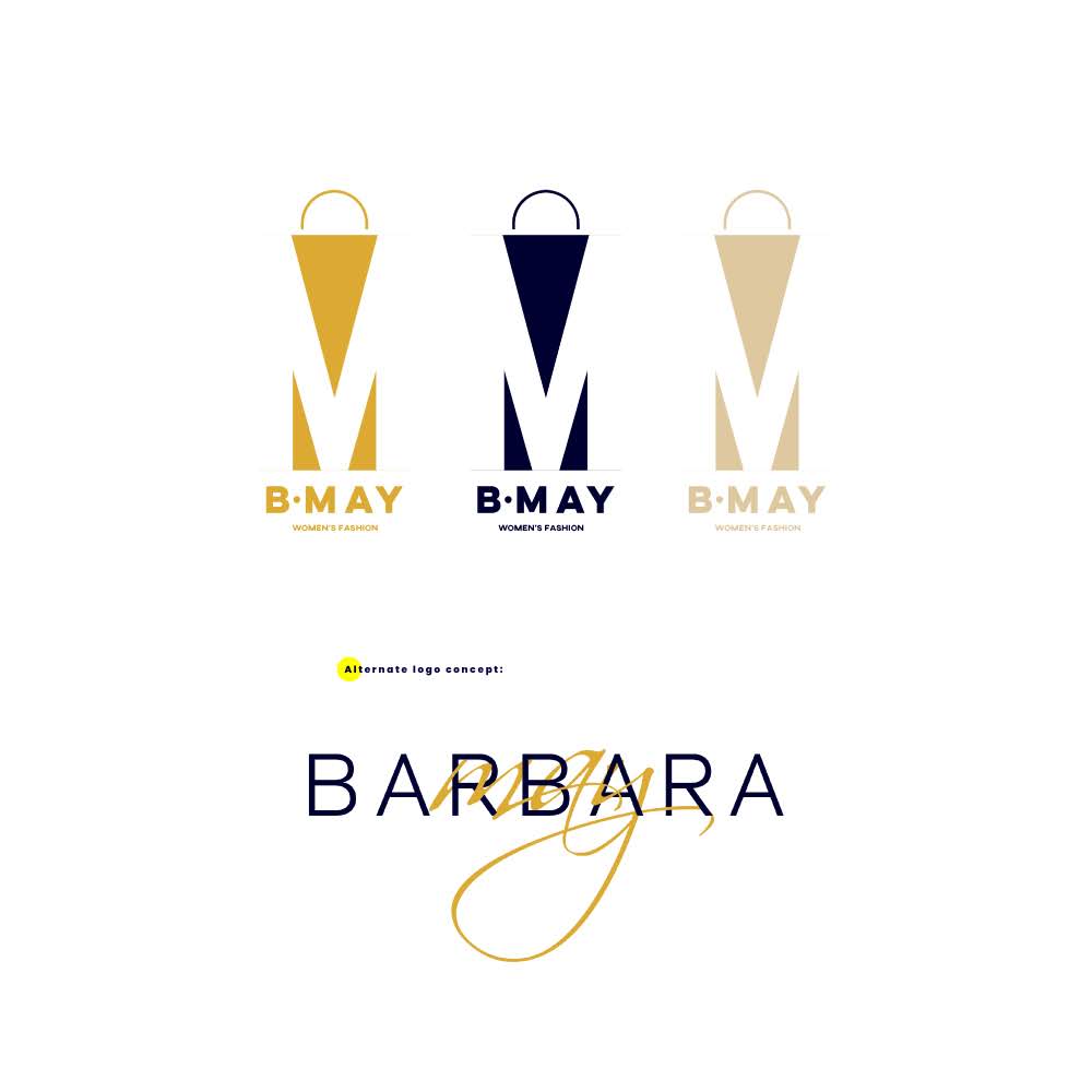
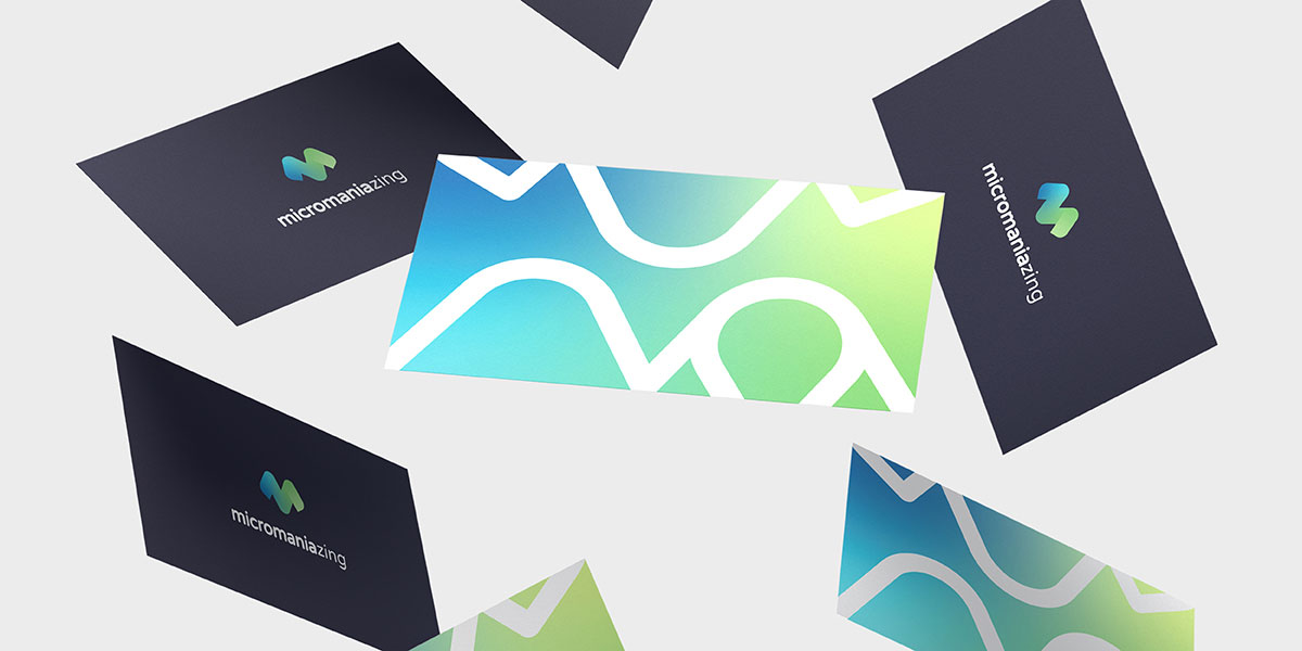
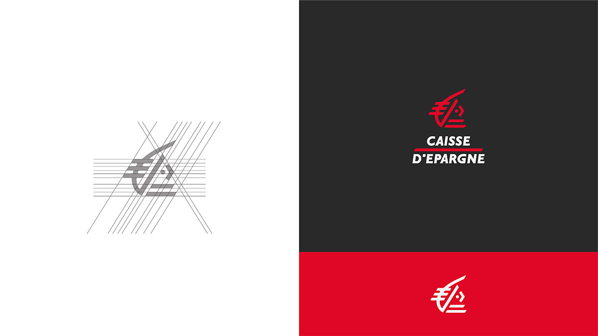
Making sure a logo can be applied and is practical is an additional step we take. Does it work on a dark background? That's the number one question we ask during this step. It's not rare that a brand has to use its logo on a dark background (think a website footer, for example) and all hell breaks loose when the logo simply vanishes in that case.
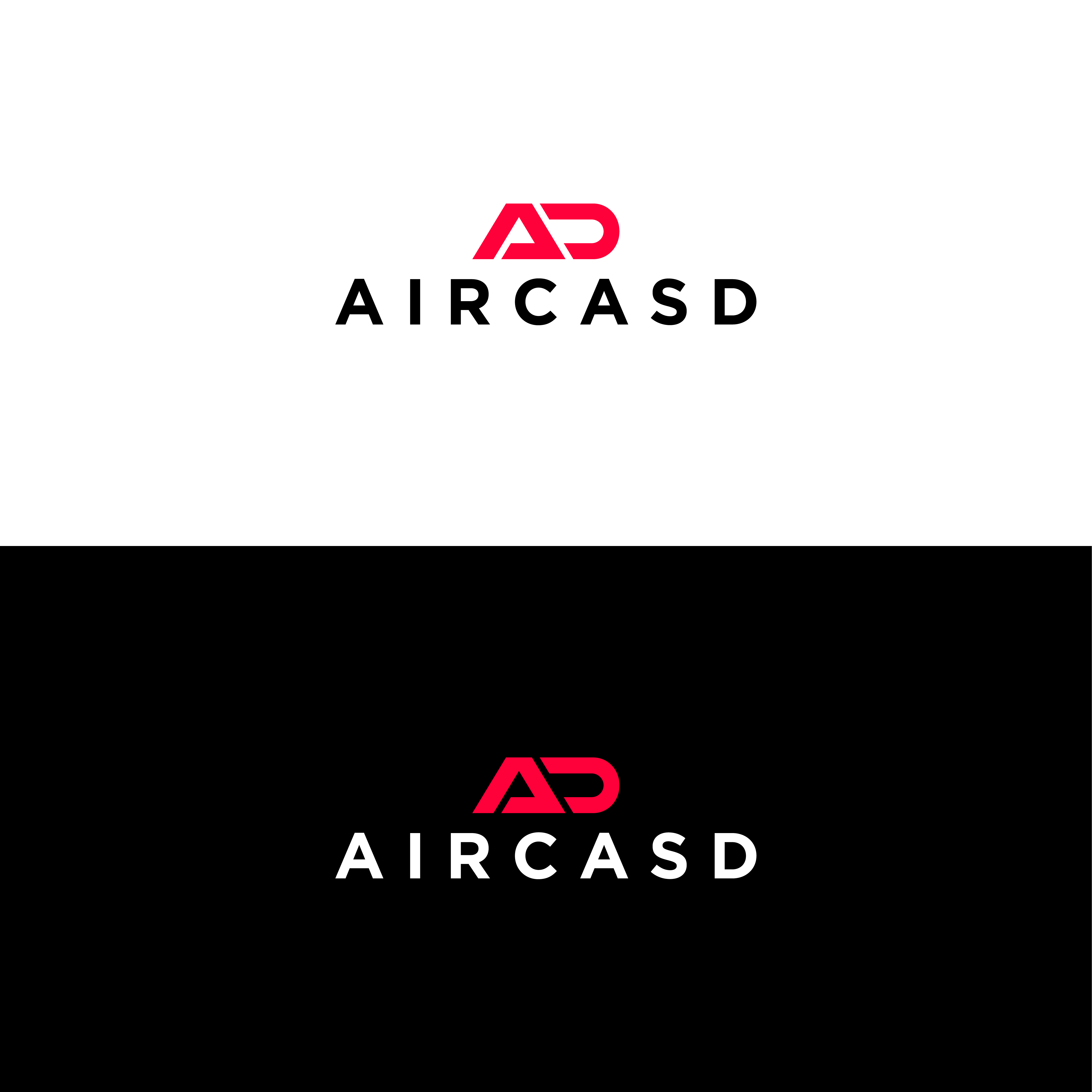
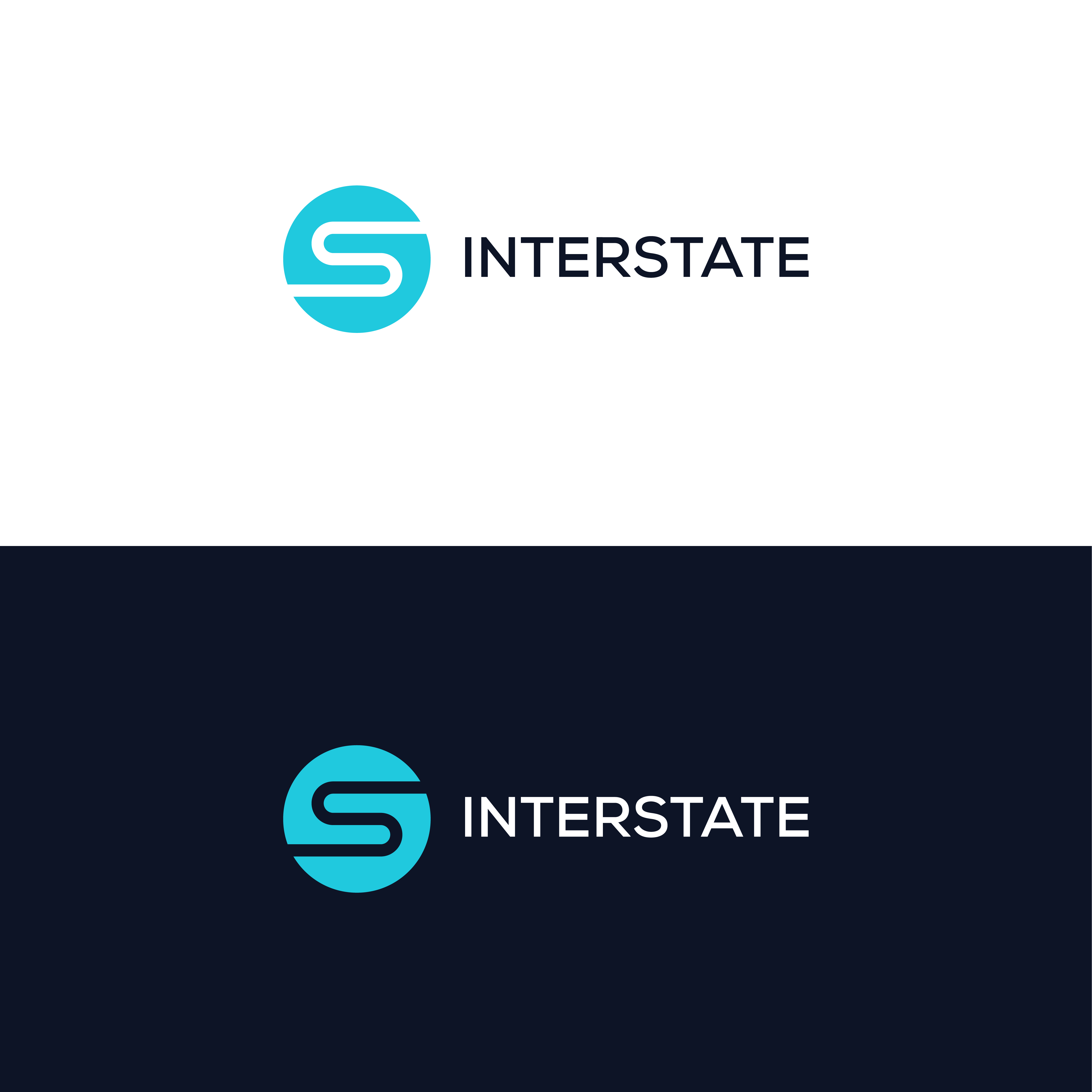


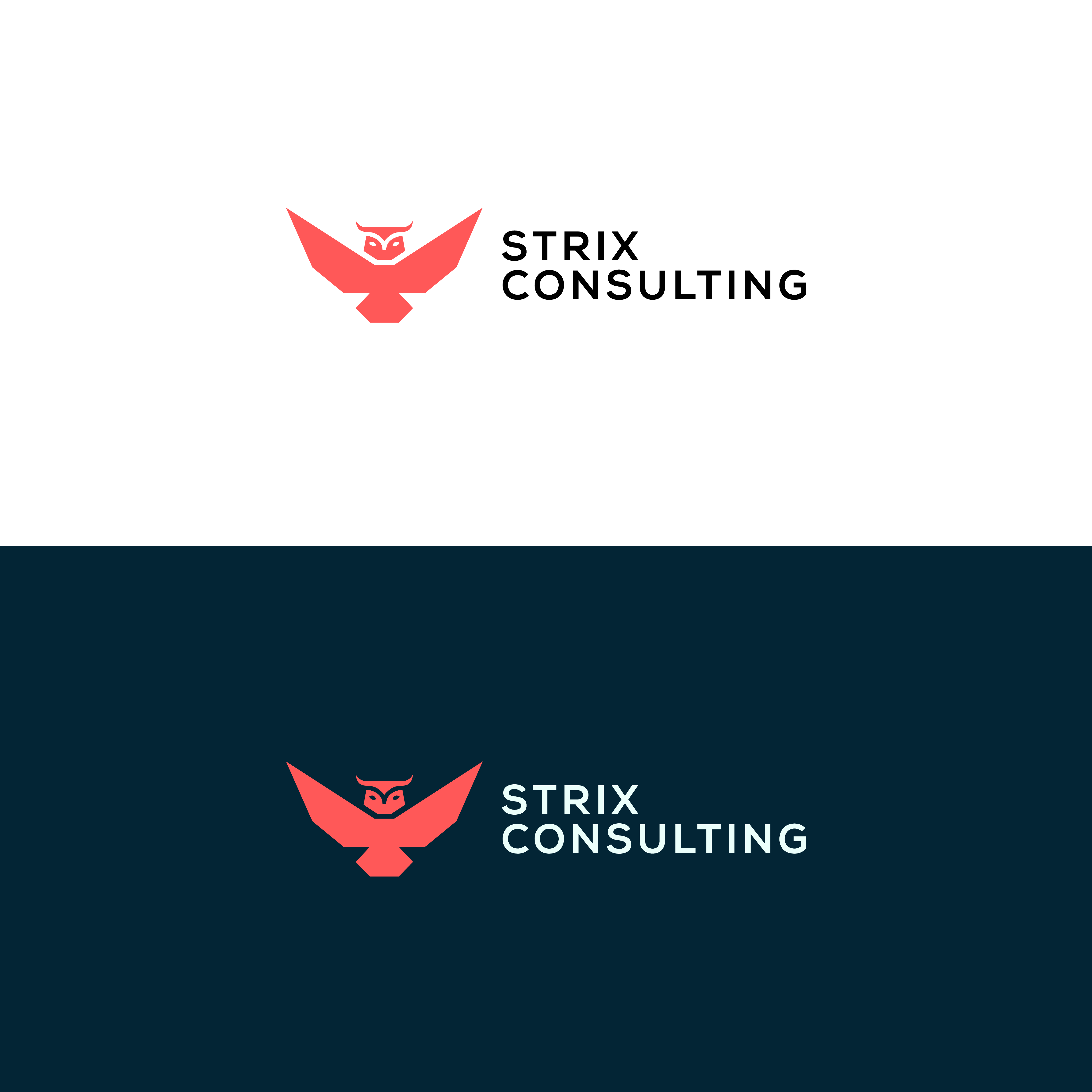
And oh, the practicality of a logo isn't just decided after it's made. Even among the various logo concepts we create, we test for applicability each and every time.
Decorative
Sometimes, you don't want a clean, modern, minimalist logo. Instead, you want something illustrative, elaborate, distinct, decorated. Although not a good practice if you're going to have a website icon as those 16x16 pixels artefacts lose all legibility if the logo is complex, it's a good practice for brands that will mostly have large-scale logo displays.

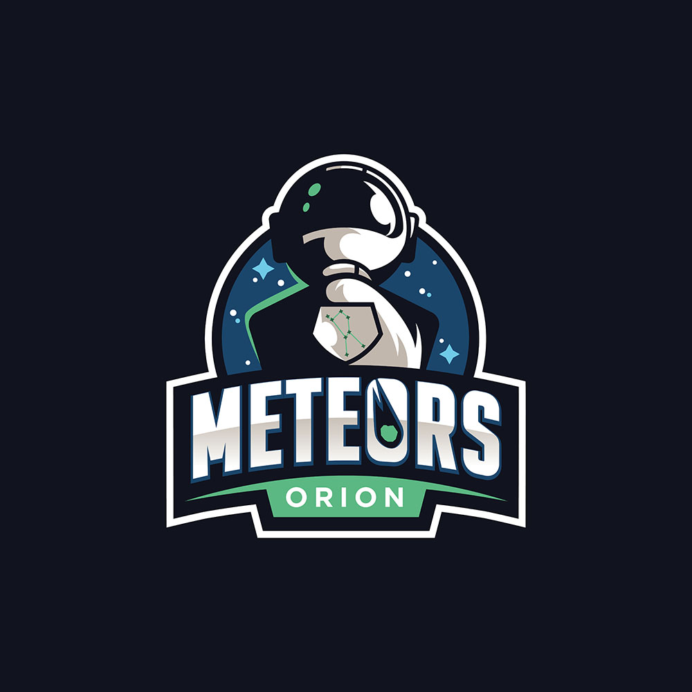
Essentially, anything you want + how it will work best
