Packaging and label design

Don't mind me. I'm here just adding some space for our amazing cubic-bezier zoom effect to work. I get paid for this.
Packaging design is more than just making what looks good. It also brings in the consideration of "what works" into the fold. If you don't take into account the shelf-life, practicality, and competition of a packaging design, your product will suffer. It's a highly competitive segment but also extremely rewarding. Packaging is the only thing 100% of your buyers interact with, so it needs to be informative along with looking good.
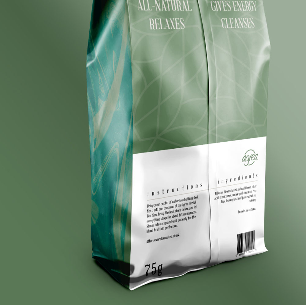
Agrea Herbal Tea
Pouch design
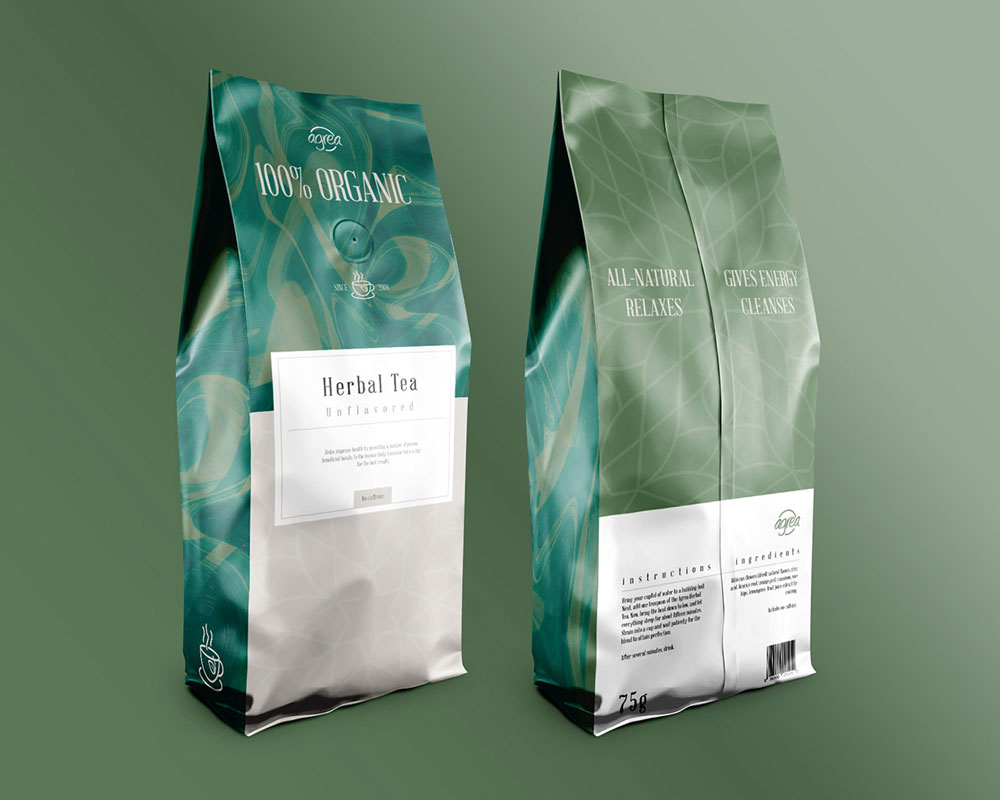
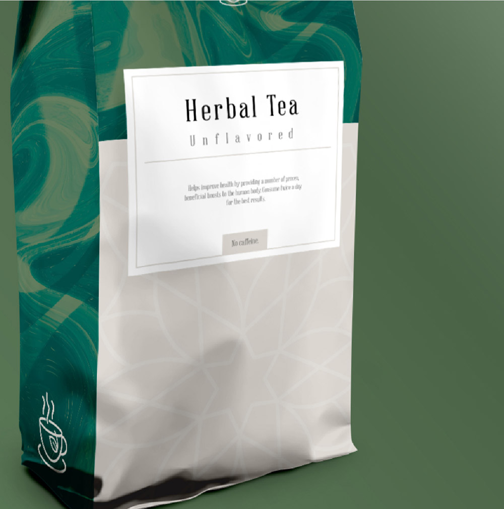
Agrea Herbal Tea's unflavored variation is an organic product that needs to give off green, nature vibes. Going unique and creative is a good thing, but sometimes a product needs what's time-tested to work. This project although uses subtle elements not conventionally found on tea pouches, but it retains the spirit of a traditional green/herbal tea product any angle you look from.
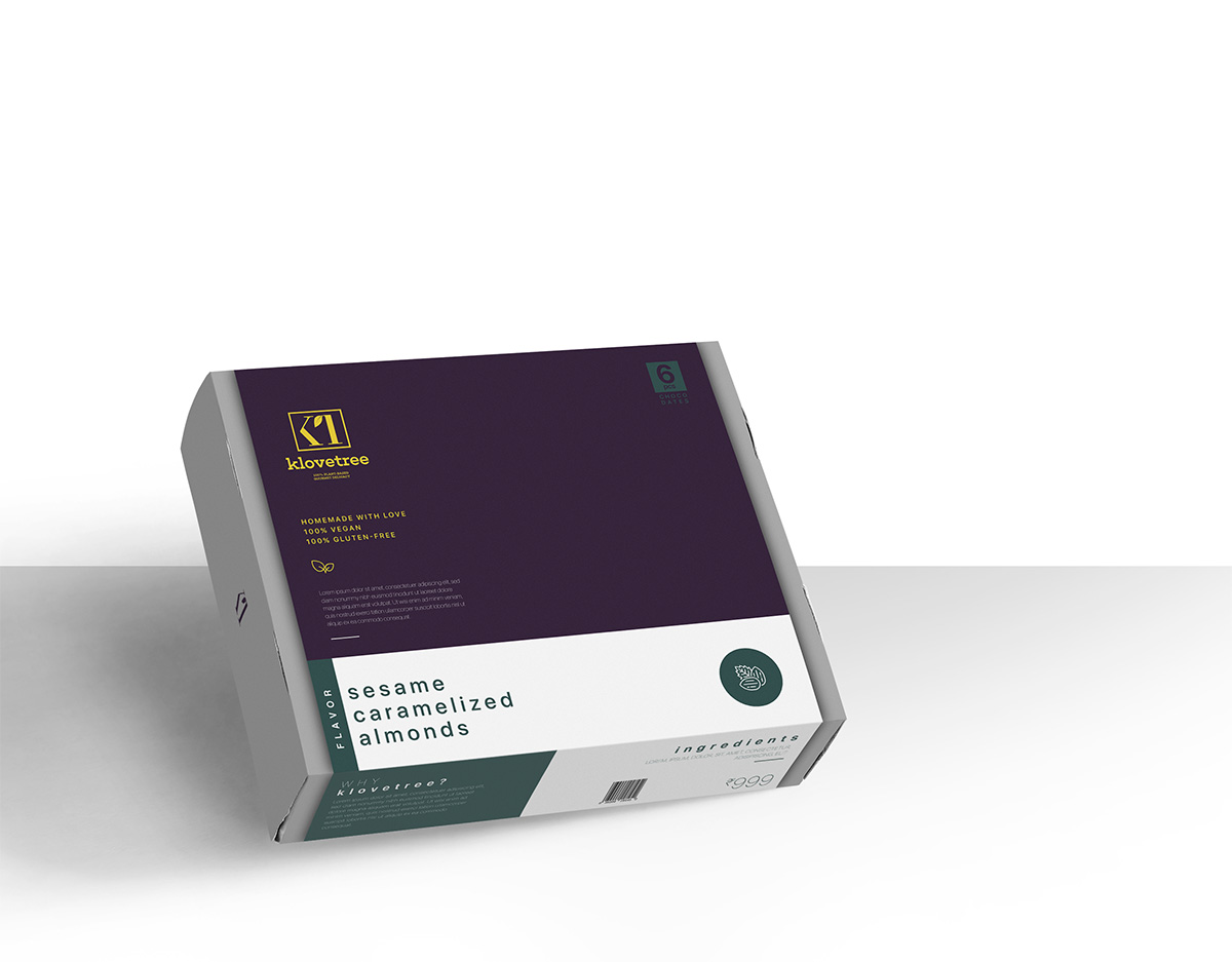
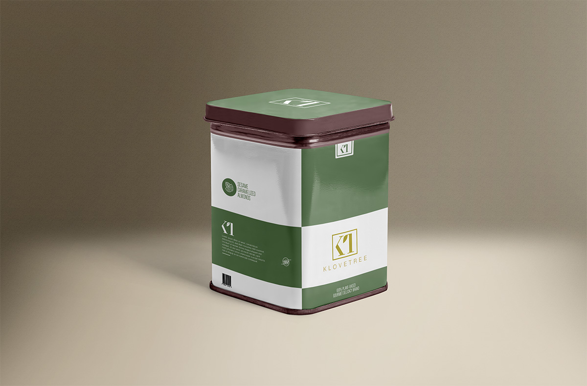
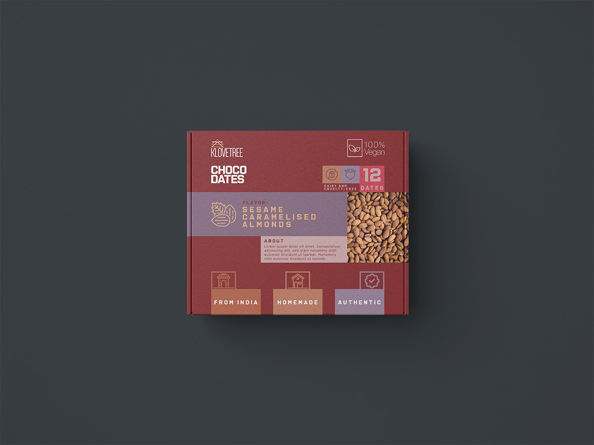
Klovetree
Klovetree - homemade choco dates based on dry fruits. We built multiple packaging options. Our considerations weren't just design-related, but function and container related too. For example: A box is good, but will a tin box be better if the customer wants to re-purchased smaller pouches and refill their order?
London Pinwheel
Office collateral/stationery design
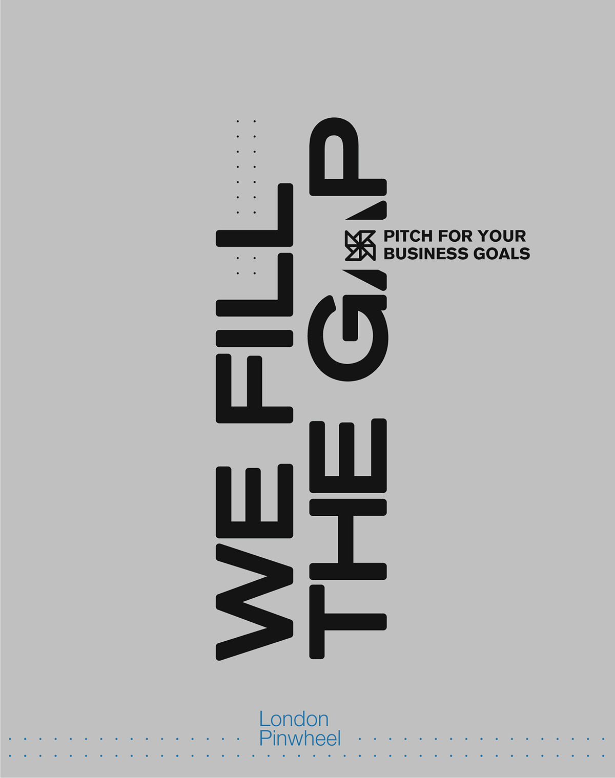
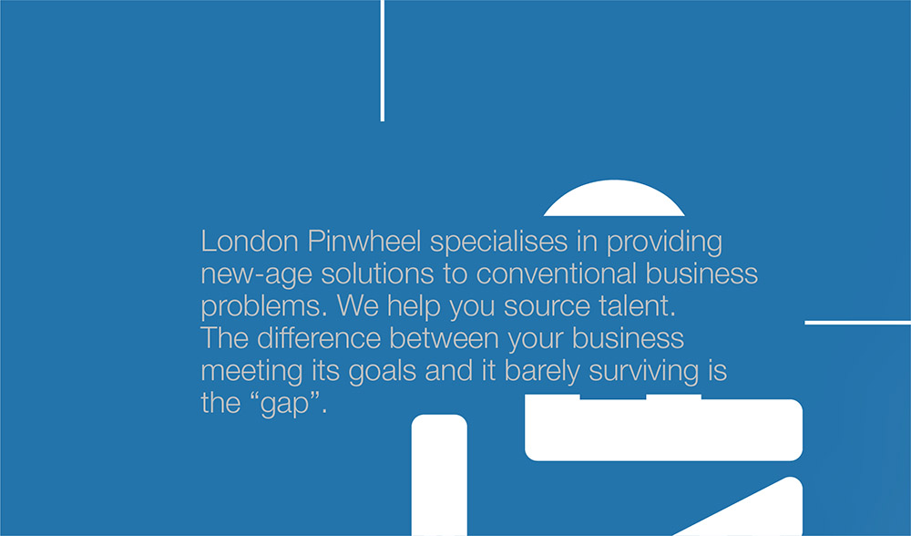
London Pinwheel sources IT talent for other businesses and they "fill the gap", so we gave them a gap-filling identity. They were not afraid to take the huge risk of looking "strange" or uncanny even.
It's not a crime to be scared of hiding or covering a part of your USP text. But every once a while, we get the chance to work with a brand that seeks to break the molds, quite like us, and intentionally hide their USP text (partly), which is a quick attention-grabber and works wonders for anything.
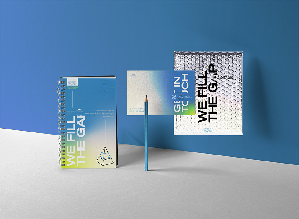
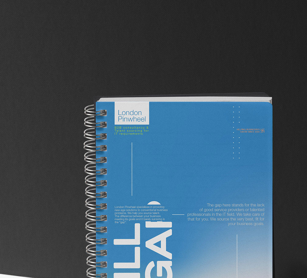
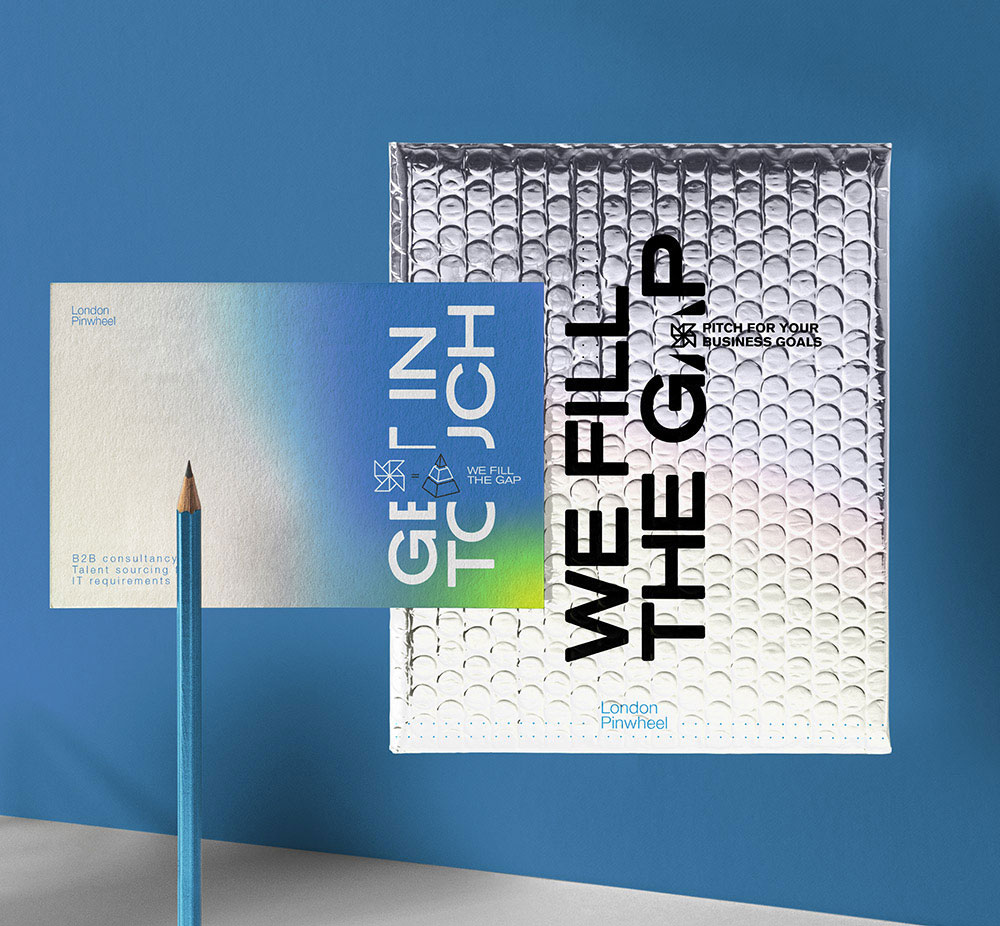
And oh, bonus fact. If you're a new company, you might not necessary have a lot of content sorted out for your brand to be used on your marketing and branding designs. We help you out there. Once we have a brand understanding, which we need anyway, we can put our copywriting skills to use for you. For most of the projects we work on, we end up doing sales copywriting and marketing content anyway. London Pinwheel is a good example of how well we develop the market understanding and then morph it into meaningful, laser-targeted content.

Mario's
Restaurant takeaway packaging design
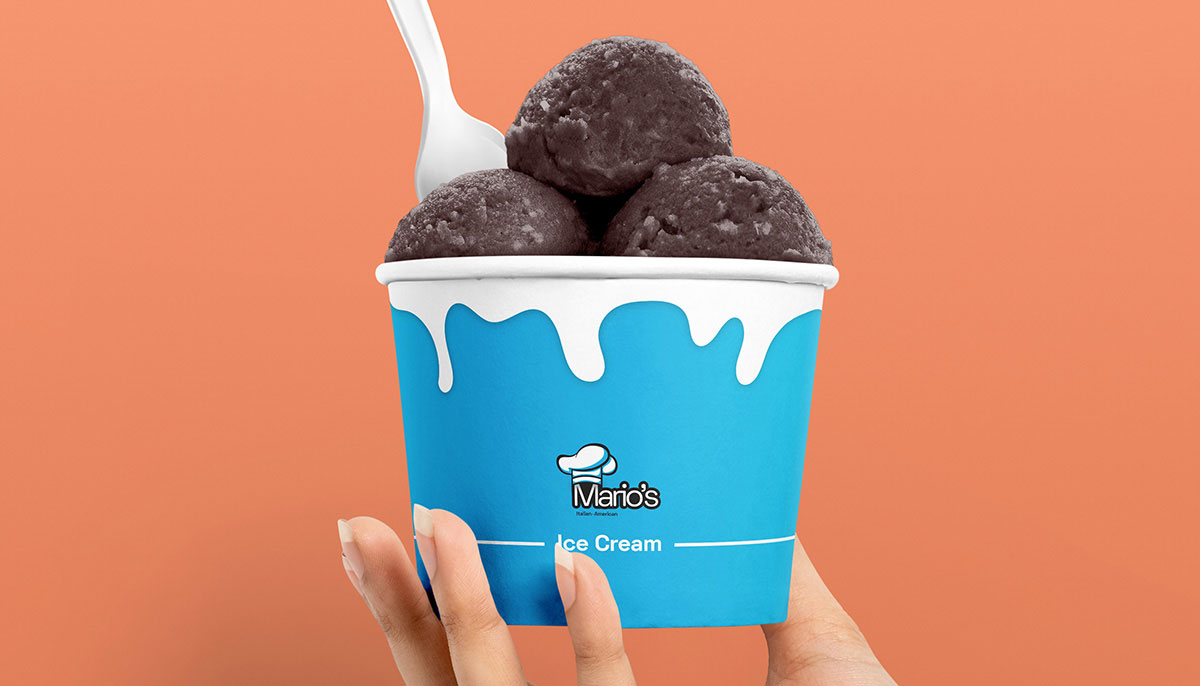
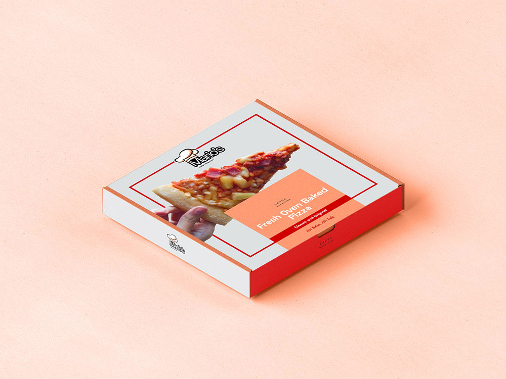
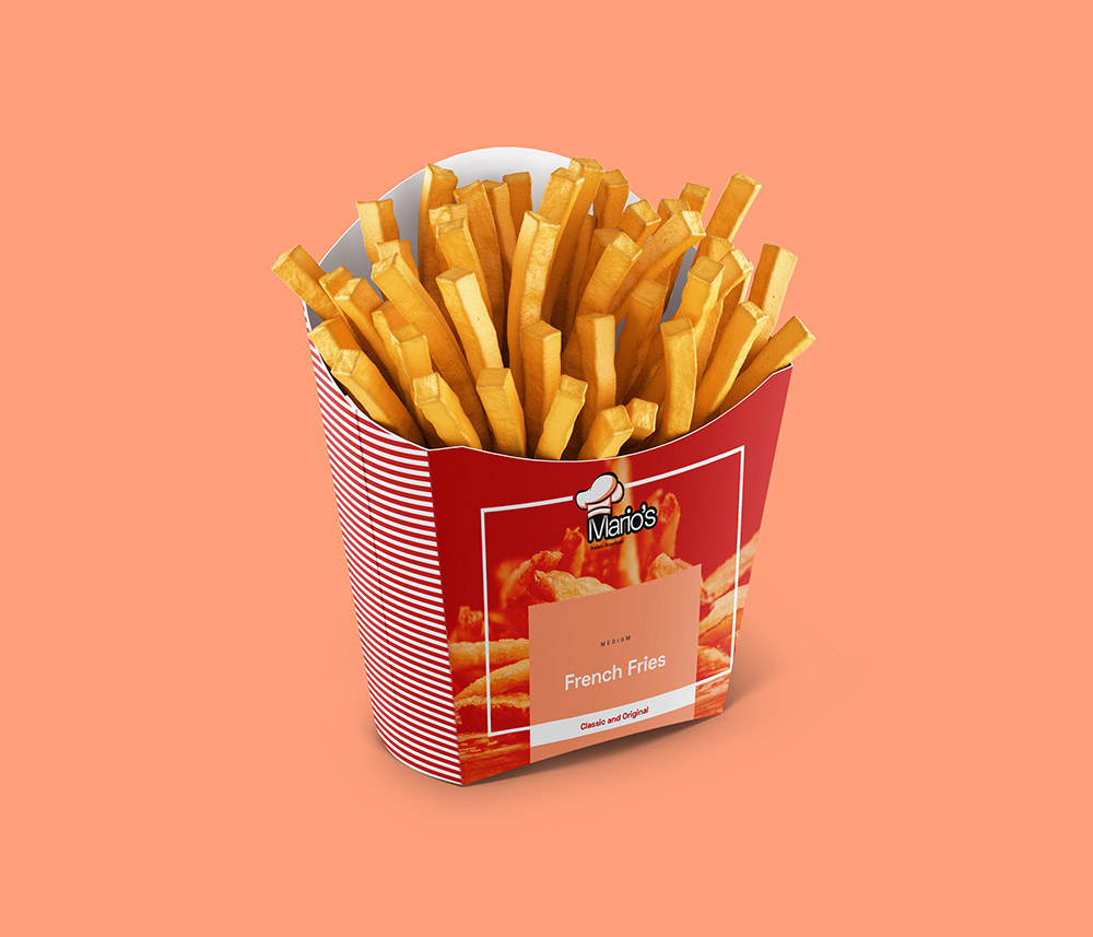
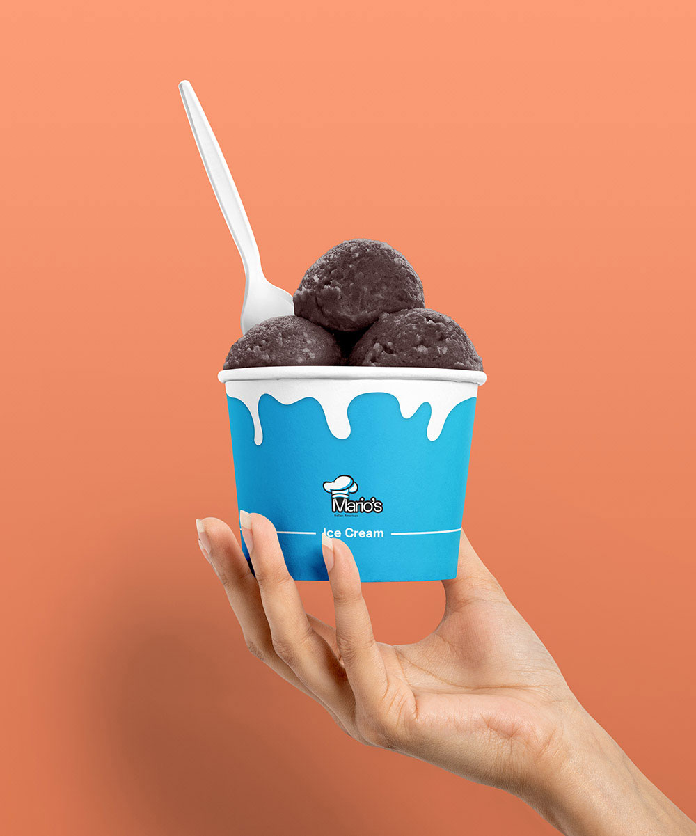
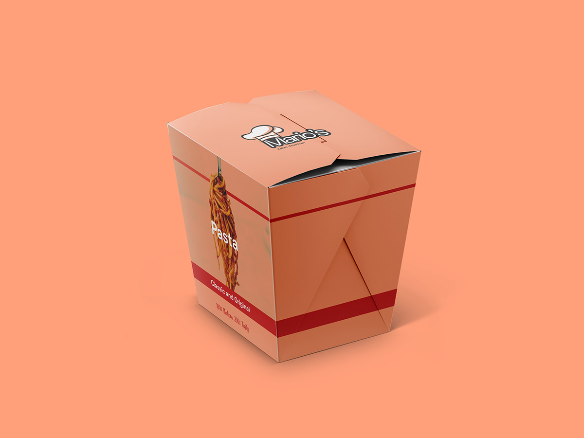
Mario's - American and Italian, but also fun and casual. Everything from the color setting to the logo, the type, and the visual anecdotes culminates into one consistent, appealing packaging design that people will love to carry with them and look at twice before using.
Sawyer
Printed can design
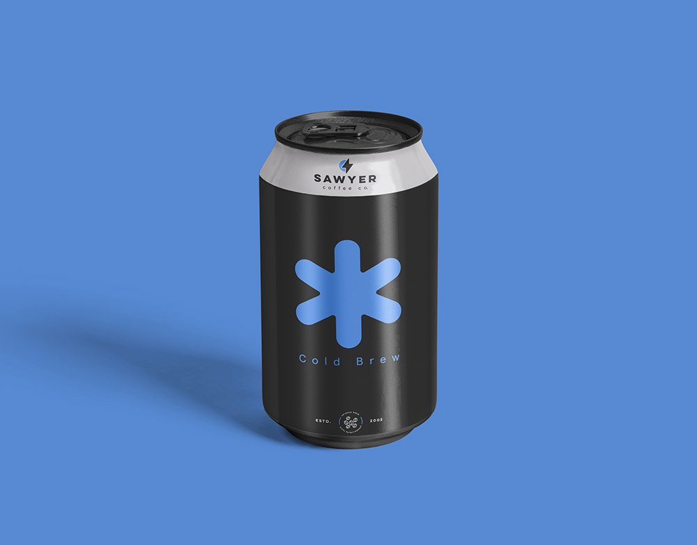
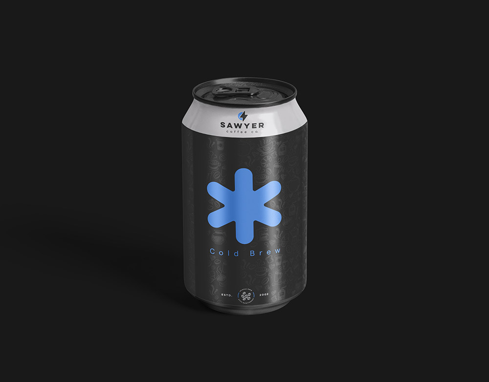
Sawyer Coffee Co. has a cold brew that they serve cold in a can. We created two variations for them because coffee is love ❤️
One was plain, and another was a more decorative version. The idea was to get one chosen. But what happened instead is they took both designs and priced one higher with a slightly different blend that they were working on already. Win-win!
Liquor packaging
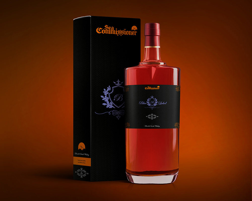
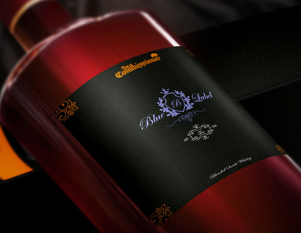
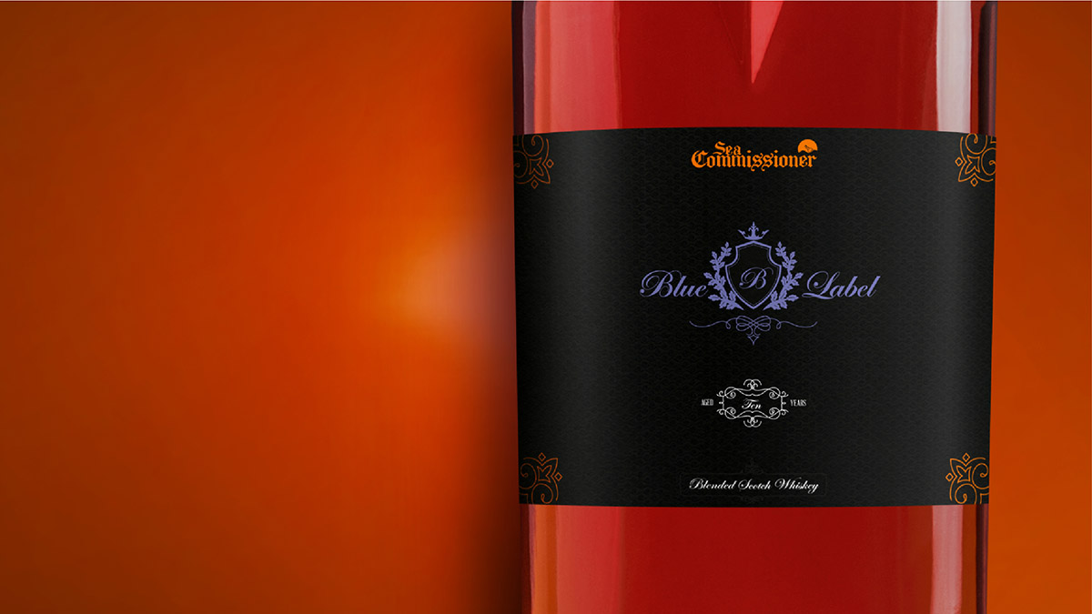
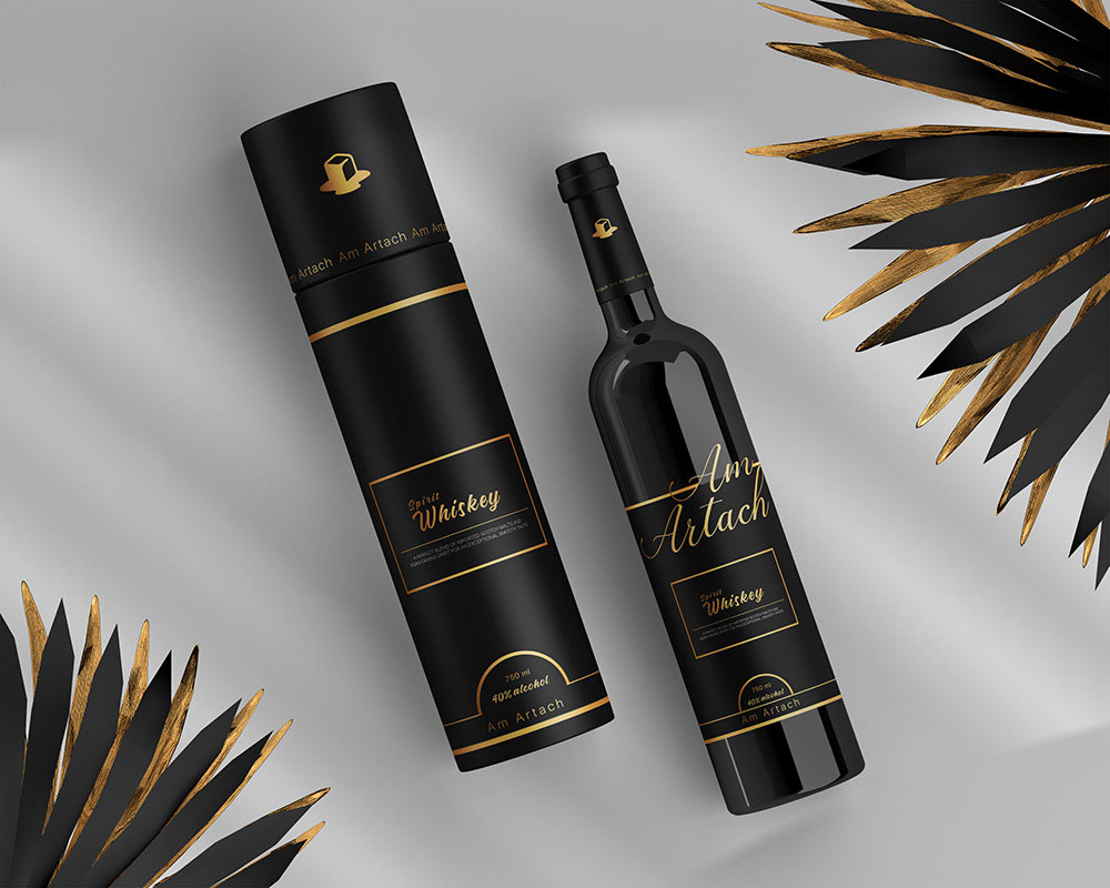
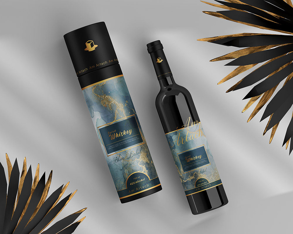
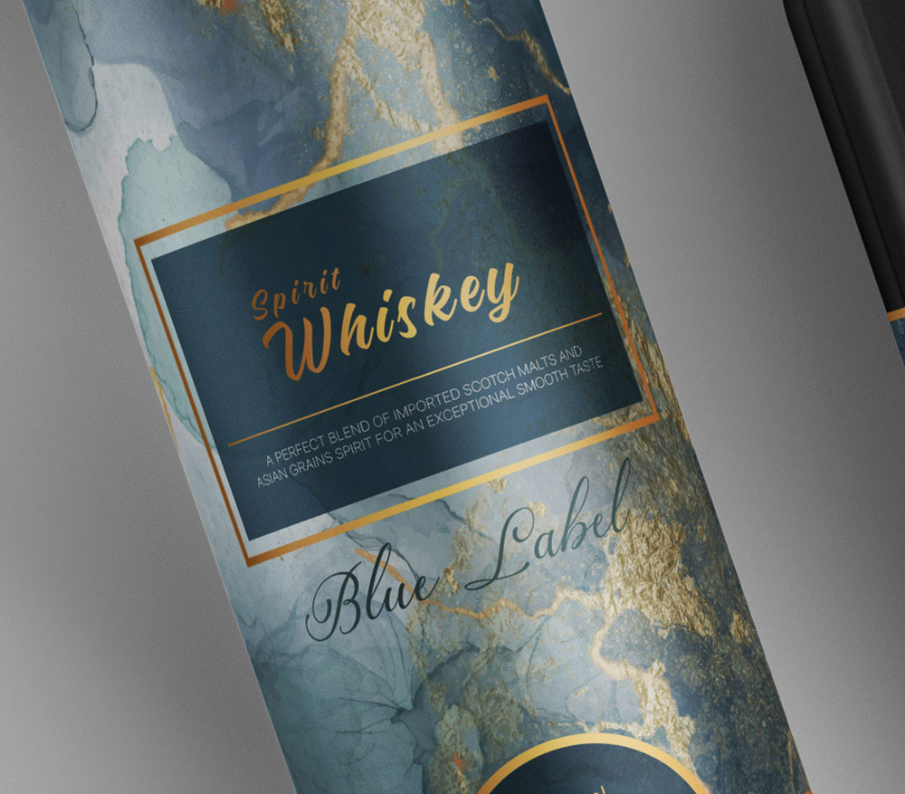
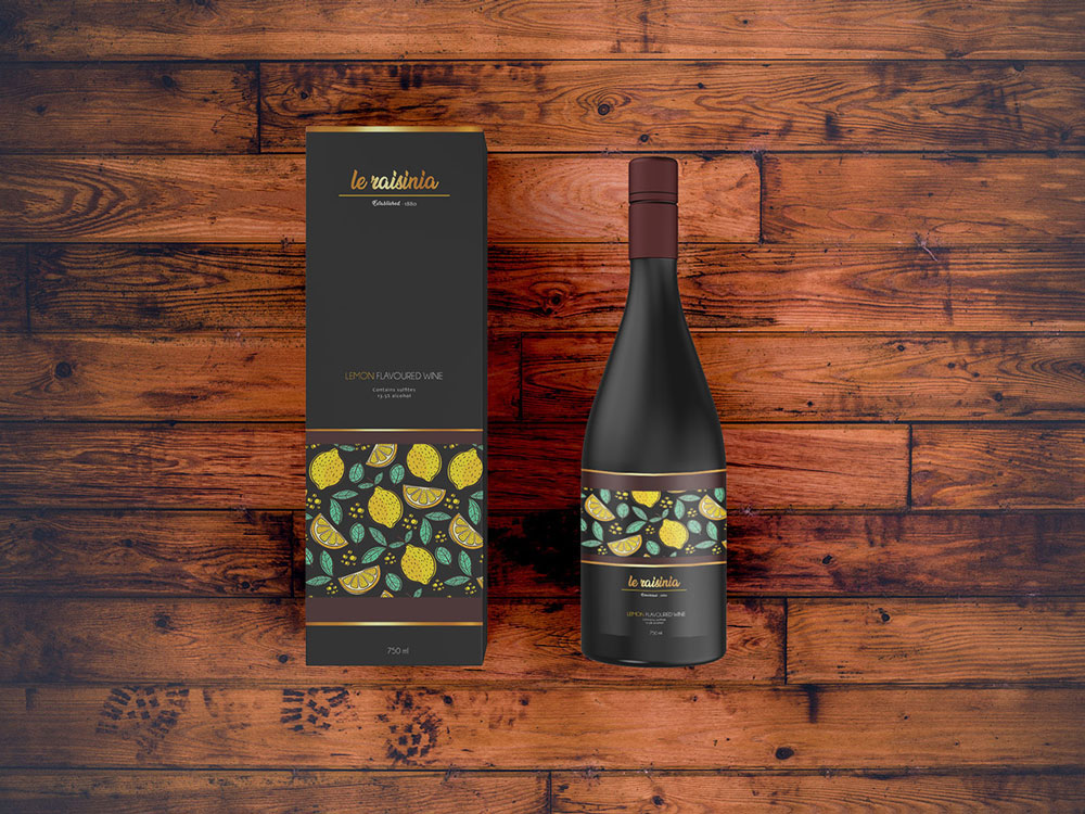
There's really little point in doing label design when you don't get to design the blue and black labels! The first set is Sea Commissioner Blue Label. Then, Am Artach's Irish spirit whiskey. Following it is the modest Le Raisinia lemon-flavored wine. Whether these brands sent us a payment or an undisclosable crate on our request is confidential company information.
Sea Commissioner Blue Label
Am Artach Standard and Blue Label
Le Raisinia lemon-flavored wine
der Stil
Product packaging design
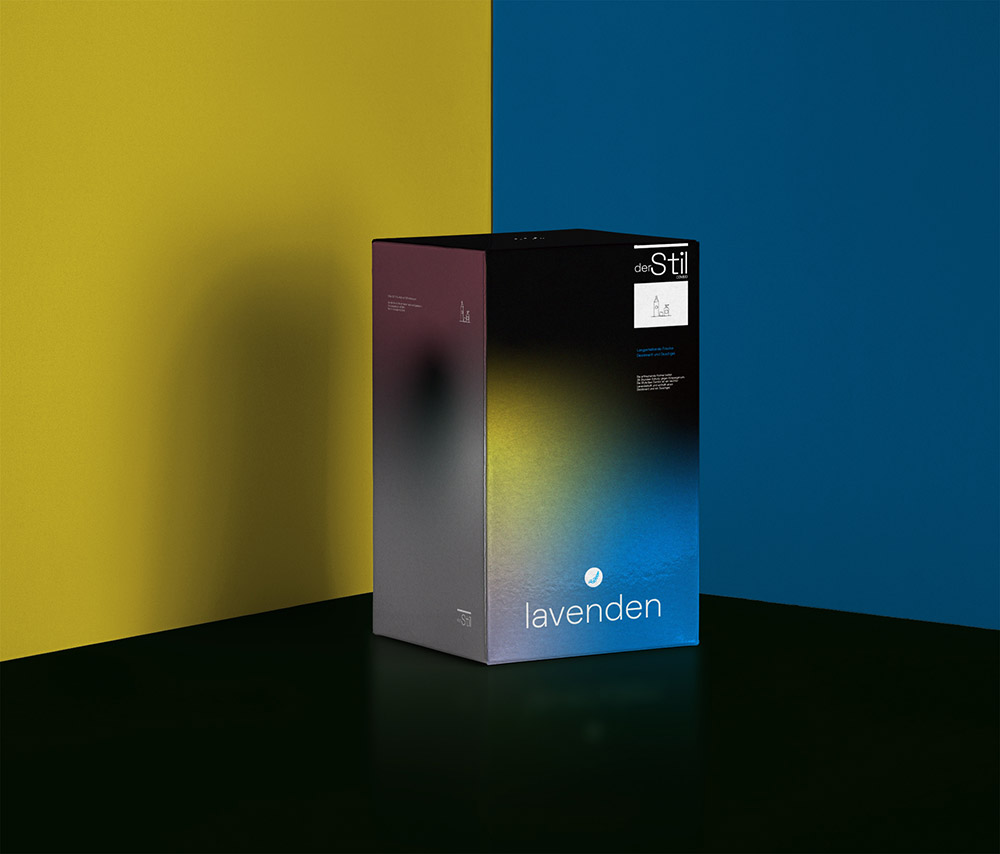
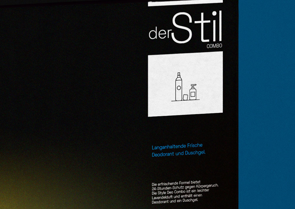
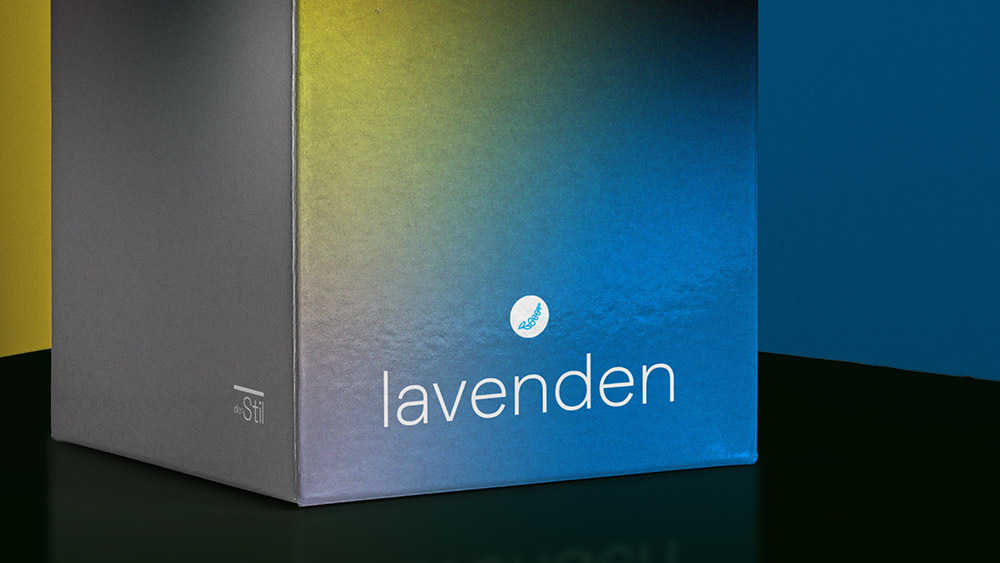
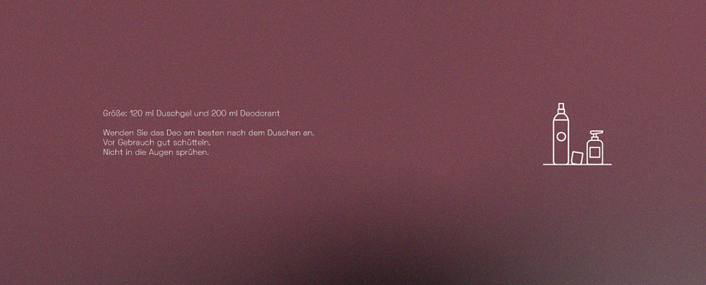
der Stil is all about fragrance and a touch of dark. Abstraction was the way to go for us. Seamlessly blending art signifies what the lavendar-scented products in the combo package stand for.
And well, some more stuff won't hurt
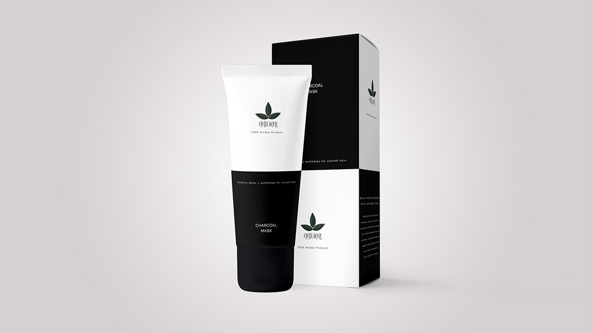
Natural's Charcoal Mask cream tube design
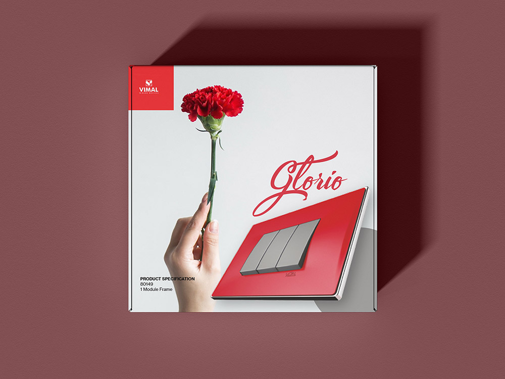
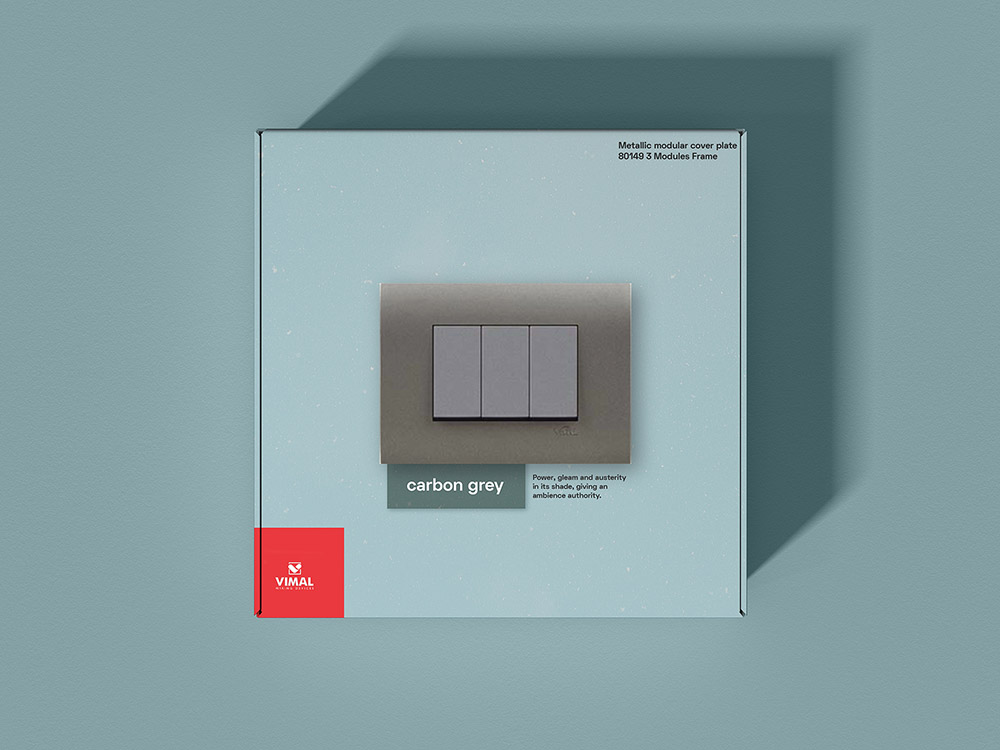
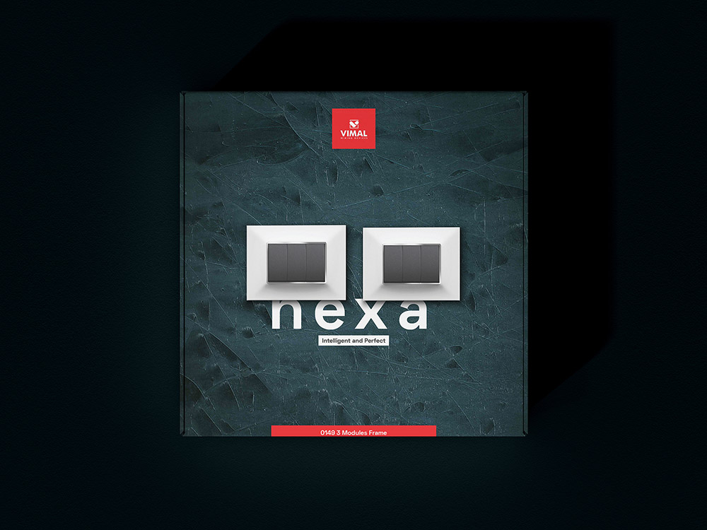
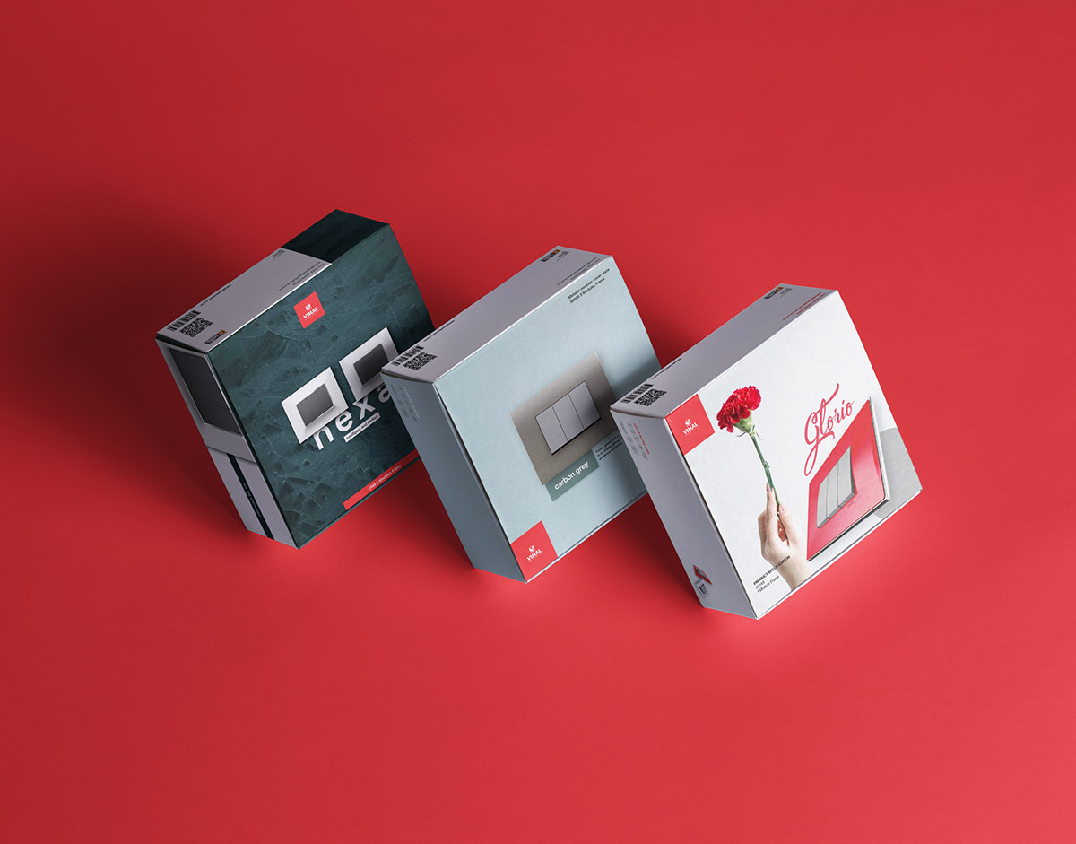
Vimal Switches product box design options created for pitching
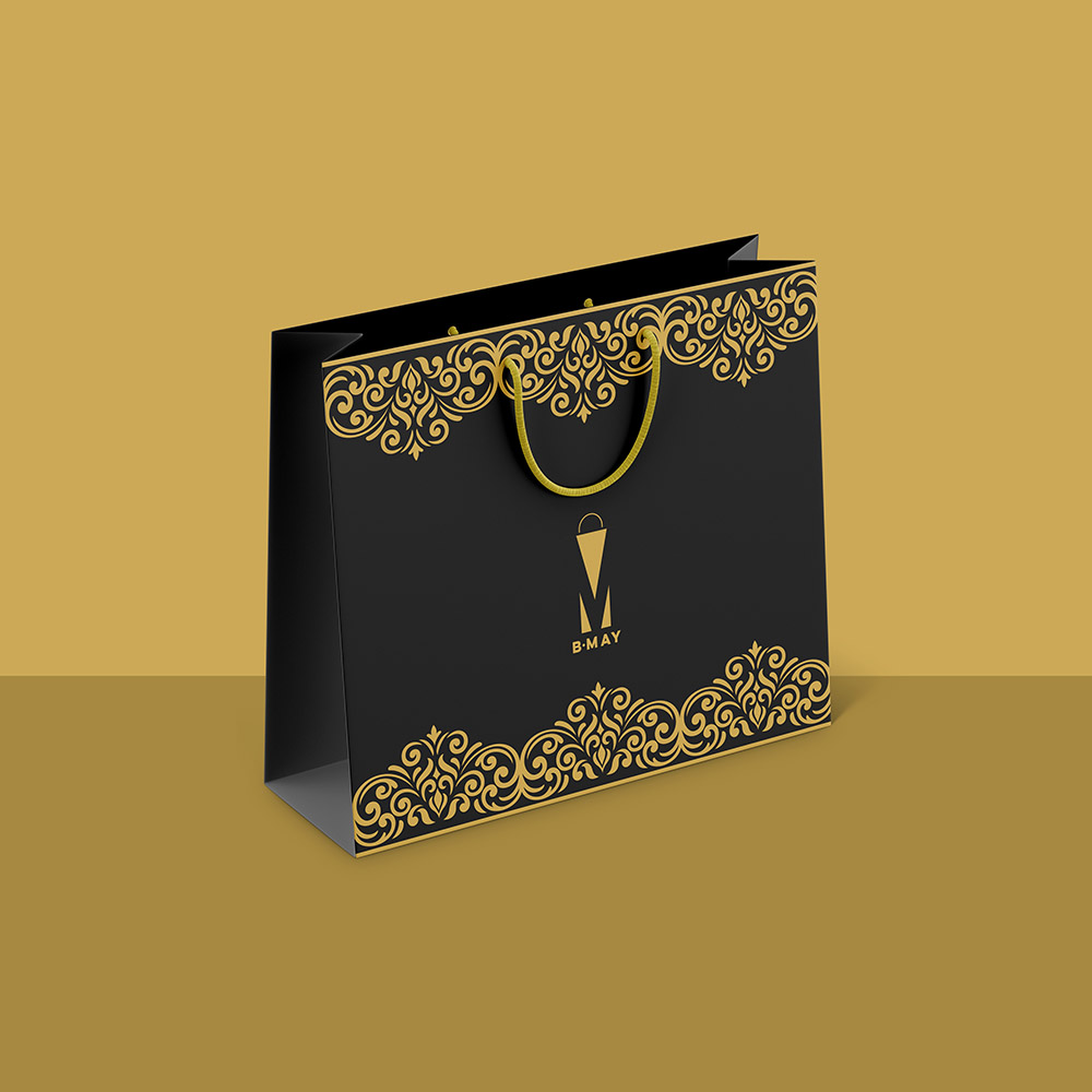
Shopping bag idea (and logo) for B.May
